

How to Increase Ecommerce Conversion Rates: A Practical Guide
Learn how to improve ecommerce conversion rates by fixing product pages, mobile UX, trust, checkout friction, site speed and customer journeys.
Improve Your StoreGetting more traffic is not always the answer to growing an ecommerce business.
Sometimes the bigger opportunity is already on your website.
If thousands of people visit your store but only a small percentage buy, increasing traffic simply sends more people through the same underperforming journey.
Conversion Rate Optimisation — commonly called CRO — focuses on improving the percentage of visitors who complete a desired action.
For ecommerce, that action is usually a purchase.
A simple ecommerce conversion-rate calculation is:
Orders ÷ Website visits × 100
So if 1,000 visits generate 30 orders, the conversion rate is 3%.
UK government guidance similarly defines ecommerce conversion as the proportion of website visitors who complete the desired action, usually a purchase, and recommends analysing user behaviour and funnel drop-off to identify opportunities for improvement. (Business Growth Service)
The important point is that CRO is not about manipulating customers.
It is about removing unnecessary friction and making it easier for people who already have buying intent to complete their purchase.
1. Don’t Chase a Universal “Good” Conversion Rate
One of the first questions ecommerce businesses ask is:
What’s a good conversion rate?
There is no universal answer.
Conversion rates vary according to:
Shopify’s current CRO guidance notes that category and context matter when evaluating conversion performance, rather than relying on one benchmark for every store. (Shopify)
So instead of asking:
Are we above or below the average?
Ask:
Where are customers dropping out, and can we improve that part of the journey?
Your own historical performance is often the most useful benchmark.
2. Start With the Conversion Funnel
Before redesigning your homepage or changing button colours, understand how customers currently move through the store.
A simplified ecommerce funnel might look like:
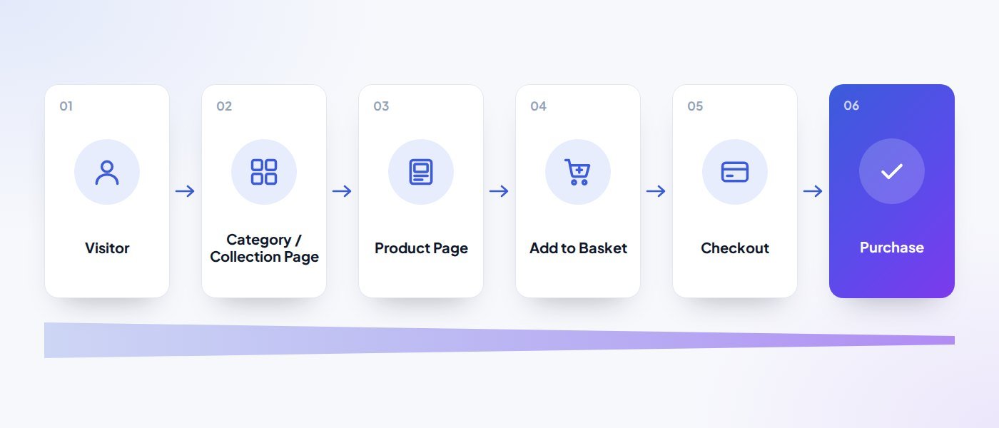
The first step in CRO is identifying where the biggest drop-offs happen.
UK government ecommerce guidance specifically recommends examining shopping-funnel abandonment to find stages where users are leaving before purchase. (Business Growth Service)
For example:
| What you see | What it may indicate |
|---|---|
| Lots of category views, few product views | Your navigation or merchandising may be weak. |
| Lots of product views, few basket additions | Product information, pricing, photography or value proposition may be the problem. |
| Lots of baskets, few checkouts | Shipping costs, trust or basket UX may be creating friction. |
| Lots of checkouts, few completed orders | The checkout itself may be the issue. |
This is why CRO should begin with evidence, not assumptions.
3. Understand Where Your Traffic Comes From
Not all traffic behaves the same way.
A visitor coming through:
“buy men’s trail running shoes”
may behave very differently from someone who discovered the product through Instagram.
Business.gov.uk recommends separating traffic sources because direct, organic, referral and social visitors can behave differently and arrive with different levels of familiarity and intent. (Business Growth Service)
Analyse conversion by:
This helps distinguish:
“Our website doesn’t convert”
from:
“This particular traffic source doesn’t convert.”
Those are very different problems.
4. Make the Value Proposition Immediately Clear
A customer landing on your store should quickly understand:
- What you’re selling
- Who it’s for
- Why it’s different
- Why they should trust you
- Why they should buy now
Shopify’s current ecommerce-conversion guidance recommends reviewing whether a product and its differentiation are immediately clear to someone encountering the brand for the first time. (Shopify)
| Weak: | Stronger: |
|---|---|
| Designed for modern lifestyles. | Lightweight waterproof jackets designed for year-round UK hiking. |
The second gives the shopper something useful.
Clarity usually beats vague brand language.
5. Improve Product Pages Before Driving More Traffic
Product pages are among the most important conversion points in an ecommerce journey.
They need to give customers enough confidence to buy without overwhelming them.
Shopify’s current CRO guidance highlights product-page optimisation — including imagery, descriptions and clearer communication — as one of the highest-impact areas to address first. (Shopify)
A strong product page should consider:
The objective is simple:
Remove unanswered questions between interest and purchase.
6. Use Better Product Photography and Video
Online customers cannot physically inspect the product.
Your media has to compensate.
Shopify recommends high-resolution product imagery and, where useful, richer formats such as video, 360-degree views or interactive media to help shoppers understand products more confidently. (Shopify)
Depending on the product, show:
- Scale
- Texture
- Different angles
- Product in use
- Packaging
- Variations
- Real-life context
For products where appearance or function matters, a short video may communicate more than several paragraphs of copy.
This also creates a natural relationship between your:
Ecommerce → Video Production → Social Media → Paid Ads
services.
7. Make Navigation Effortless
Customers should not need to understand your internal product structure.
Navigation should reflect how they actually shop.
Useful ecommerce navigation may include:
- Product type
- Category
- Use case
- Brand
- Price
- Size
- Colour
- Availability
Shopify’s 2026 ecommerce UX guidance emphasises navigation as a core part of the shopping experience, alongside product pages, mobile usability and checkout. (Shopify)
If people repeatedly use search because they cannot navigate normally, that may be a useful warning sign.
8. Search Should Help Customers Buy
For larger stores, internal search can be critical.
Customers using search often know what they want.
Make sure search handles:
- Product names
- Categories
- Common spelling mistakes
- Model numbers
- Synonyms
- Relevant attributes
And avoid dead-end:
No results found.
Instead, suggest:
- Similar products
- Categories
- Popular items
- Alternative search terms
The goal is to keep motivated buyers moving forward.
9. Mobile Is Not a Smaller Desktop Experience
Many ecommerce journeys begin or end on mobile.
Mobile optimisation means more than shrinking the desktop layout.
Review:
Shopify’s latest ecommerce UX guidance explicitly treats mobile ecommerce as a dedicated optimisation area rather than merely a responsive-design requirement. (Shopify)
A store that looks attractive on desktop but feels awkward on a phone is leaving revenue on the table.
10. Site Speed Is Part of the Customer Experience
A customer should not need patience to buy something.
Slow pages introduce friction at every stage.
Focus particularly on:
- Homepage
- Collection pages
- Product pages
- Basket
- Checkout
Common performance issues include:
- Oversized imagery
- Excessive JavaScript
- Too many third-party scripts
- Heavy tracking tools
- Unoptimised video
- Poor hosting
Speed is not a design detail.
It is part of the shopping experience.
11. Build Trust Before Asking for the Sale
Customers ask themselves questions such as:
Is this business legitimate?
Will the product arrive?
Can I return it?
Is payment secure?
What do other customers think?
Trust-building elements might include:
- Genuine reviews
- Clear returns policy
- Delivery information
- Secure payment options
- Contact details
- Company information
- Guarantees where genuine
- Real customer photography
- Recognisable payment methods
Shopify’s conversion-centred design guidance includes clear trust signals as an important part of reducing buyer hesitation. (Shopify)
Do not bury reassurance in the footer.
Put it where customers need it.
12. Make Shipping Costs Clear Early
Unexpected costs can create abandonment.
If delivery charges only appear late in checkout, shoppers may feel the true price was hidden.
Where possible, communicate:
- Delivery cost
- Free-delivery threshold
- Estimated delivery time
- Collection options
- International shipping restrictions
Clarity reduces uncertainty.
If free shipping begins at £50, say it clearly:
Free UK delivery on orders over £50
That can also encourage customers to increase basket value.
13. Simplify the Basket
Your basket should help customers complete their purchase, not distract them.
Review whether shoppers can easily:
- Change quantity
- Remove an item
- See product variants
- Understand delivery
- See the total
- Continue to checkout
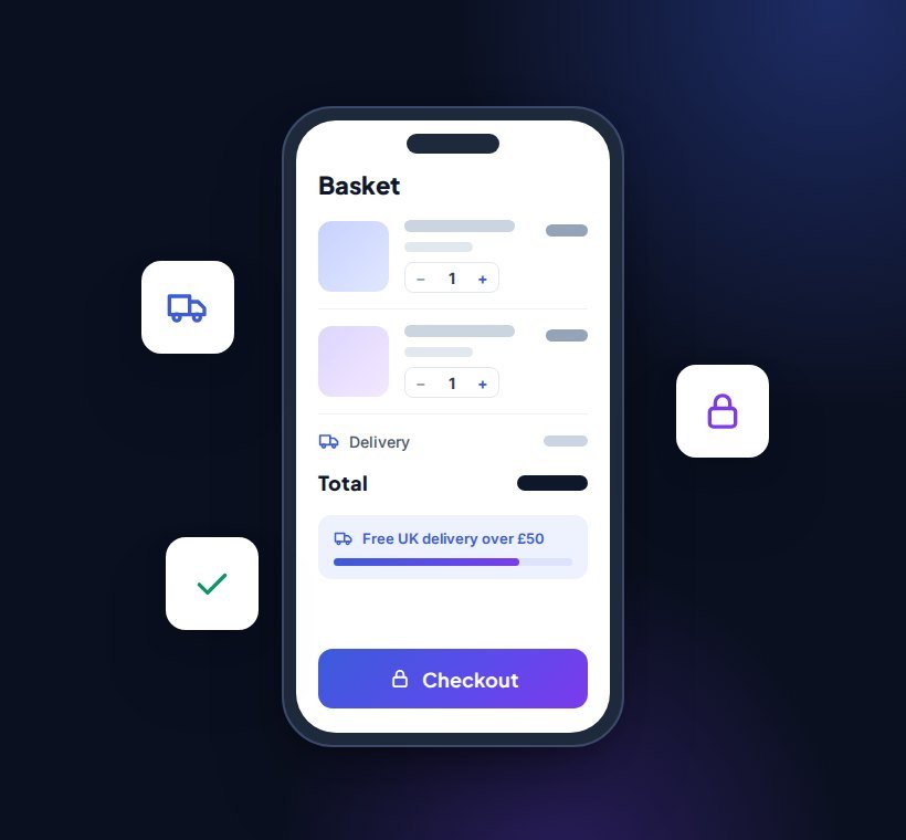
Avoid filling the basket with too many distractions.
Cross-sells can be useful.
But the primary objective remains:
complete the purchase.
14. Remove Checkout Friction
Checkout is one of the most important places to focus.
Baymard research cited by Shopify’s 2026 ecommerce UX guidance places average cart abandonment around 70%, illustrating how significant checkout friction can be. (Shopify)
Common checkout problems include:
- Too many form fields
- Forced account creation
- Unclear delivery options
- Limited payment methods
- Unexpected fees
- Poor mobile forms
- Slow pages
- Errors that are difficult to understand
Shopify’s CRO guidance similarly identifies checkout optimisation as one of the most important conversion opportunities. (Shopify)
Ask of every checkout field:
Do we genuinely need this information before the customer can buy?
If not, consider removing it.
15. Offer Appropriate Payment Options
Customers increasingly expect flexibility.
Depending on your store and market, options might include:
- Debit/credit cards
- Apple Pay
- Google Pay
- PayPal
- Shop Pay
- Buy-now-pay-later options where appropriate
Familiar and convenient payment methods can reduce friction.
However, avoid adding payment options purely because competitors have them.
Use customer behaviour and market relevance to decide.
16. Improve Calls to Action
A CTA should make the next action obvious.
For ecommerce:
Add to Basket
is usually clearer than:
Continue
or:
Explore
Shopify’s conversion-centred design guidance recommends keeping CTAs clear and minimising unnecessary steps between intent and completion. (Shopify)
Use visual hierarchy so customers can easily identify the primary action.
17. Use Reviews Strategically
Reviews can reduce perceived risk.
But placement matters.
Useful locations include:
Consider displaying:
- Overall rating
- Number of reviews
- Recent feedback
- Relevant product-specific comments
Avoid fabricated or anonymous-looking testimonials.
Trust only works when it feels credible.
18. New and Returning Customers Behave Differently
Returning customers already understand your brand.
New customers do not.
Business.gov.uk specifically recommends analysing new and returning visitors separately because their behaviour and conversion patterns often differ. (Business Growth Service)
New visitors may need more:
- Brand explanation
- Trust
- Product context
- Reviews
- Reassurance
Returning customers may want:
- Faster navigation
- Recently viewed products
- Saved baskets
- Easy repeat purchase
One experience does not need to treat every shopper identically.
19. Use Behaviour Data, Not Opinions
Tools such as:
can help identify problems.
Business.gov.uk specifically suggests click analysis and heatmapping where customers appear to interact heavily but fail to convert. (Business Growth Service)
Shopify also recommends combining analytics with behavioural tools when performing CRO analysis. (Shopify)
Instead of debating:
“I don’t like this button.”
look for evidence such as:
“Only 18% of mobile product visitors scroll far enough to see delivery information.”
That gives you something useful to fix.
20. Test Changes Properly
CRO should be iterative.
A typical cycle is:
Observe → Identify problem → Create hypothesis → Make change → Measure → Learn → Repeat
Shopify describes CRO as an ongoing, data-driven process rather than a one-time redesign. (Shopify)
Do not change ten major things simultaneously if you need to understand what caused the result.
21. Prioritise Experiments by Impact
Not every idea deserves immediate implementation.
A useful prioritisation framework considers:
Shopify demonstrates a similar prioritisation approach in its current CRO guidance. (Shopify)
For example:
| Priority | Example |
|---|---|
| High priority | Fix broken checkout on mobile. |
| Lower priority | Experiment with a different footer colour. |
Focus effort where customer friction and commercial impact are highest.
22. Track More Than Conversion Rate
Conversion rate matters, but it should not be viewed alone.
Useful ecommerce metrics include:
| Metric | What it tells you |
|---|---|
| Conversion rate | What proportion purchase? |
| Average order value | How much do customers spend? |
| Add-to-cart rate | How many product viewers show buying intent? |
| Checkout completion rate | How many people who start checkout finish? |
| Customer acquisition cost | How much does it cost to acquire a customer? |
| Revenue per visitor | How much commercial value does each visit generate? |
| Repeat purchase rate | How often do customers return? |
Shopify’s 2026 ecommerce KPI guidance recommends focusing on a smaller set of decision-relevant metrics such as conversion rate, average order value and customer acquisition cost rather than collecting data without a clear purpose. (Shopify)
23. Conversion Rate and Average Order Value Need Balance
Imagine conversion increases from 3% to 4%.
That sounds positive.
But if aggressive discounts caused average order value and margin to collapse, the business may not actually be healthier.
The goal should be:
profitable conversion
not conversion at any cost.
This is why CRO needs to connect to commercial metrics.
24. Traffic Quality Matters
If your store suddenly receives large amounts of low-intent traffic, conversion rate may fall even if nothing is wrong with the website.
This often happens when businesses:
- Expand paid targeting
- Run awareness campaigns
- Go viral socially
- Target broad informational keywords
Analyse conversion by source before assuming the store is broken.
Sometimes the problem is not:
website conversion
It is:
audience quality.
25. Ecommerce SEO and CRO Should Work Together
SEO brings relevant customers into the store.
CRO helps those customers buy.
This makes the relationship important:
Search intent → Category/Product Page → Useful product information → Trust → Purchase
Ranking for a keyword that sends the wrong audience is not useful.
Likewise, excellent product pages have limited value if nobody can discover them.
26. Paid Advertising and CRO Should Work Together
The same principle applies to Google Ads and Meta Ads.
If acquisition costs are rising, the instinct is often:
optimise the ads.
Sometimes the more valuable improvement is on the website.
For example:
If:
- CPC stays the same
- Traffic stays the same
- Conversion improves
then your effective customer acquisition cost can fall.
CRO helps you extract more value from traffic you already pay for.
27. Common Ecommerce CRO Mistakes
| Mistake | What to remember |
|---|---|
| Copying competitors | Their solution may not address your problem. |
| Testing without enough data | Small sample sizes can produce misleading results. |
| Obsessing over button colours | Fix major friction before cosmetic details. |
| Changing too many things simultaneously | You may not know what caused the result. |
| Optimising only desktop | Mobile may represent a large proportion of customers. |
| Ignoring traffic quality | Not every conversion problem is a UX problem. |
| Focusing only on the checkout | Conversion begins before the customer reaches the basket. |
28. Where Should You Start?
If you want to improve an ecommerce store, start here:
Ecommerce CRO Checklist
Before spending more to generate traffic, ask:
- Is the value proposition clear?
- Is navigation intuitive?
- Are product images strong?
- Are product benefits explained?
- Are delivery costs obvious?
- Are returns clear?
- Is trust visible?
- Does the site perform well on mobile?
- Is checkout simple?
- Are relevant payment methods available?
- Is conversion tracking accurate?
- Do we know where people drop out?
- Are acquisition channels bringing the right audience?
- Are we testing improvements?
If several answers are no, there may already be significant opportunities within your existing traffic.
Conclusion
Increasing ecommerce conversion rates rarely comes down to one clever trick.
It comes from understanding the customer journey and systematically removing friction.
Start with the data.
Find where customers struggle.
Then improve the parts of the experience that matter most:
Shopify’s current CRO guidance makes the same broader point: optimisation works best as an ongoing process of analysing customer behaviour, testing improvements and learning from the results. (Shopify)
More traffic can grow an ecommerce business.
But getting more value from the traffic you already have can sometimes be the smarter place to start.